
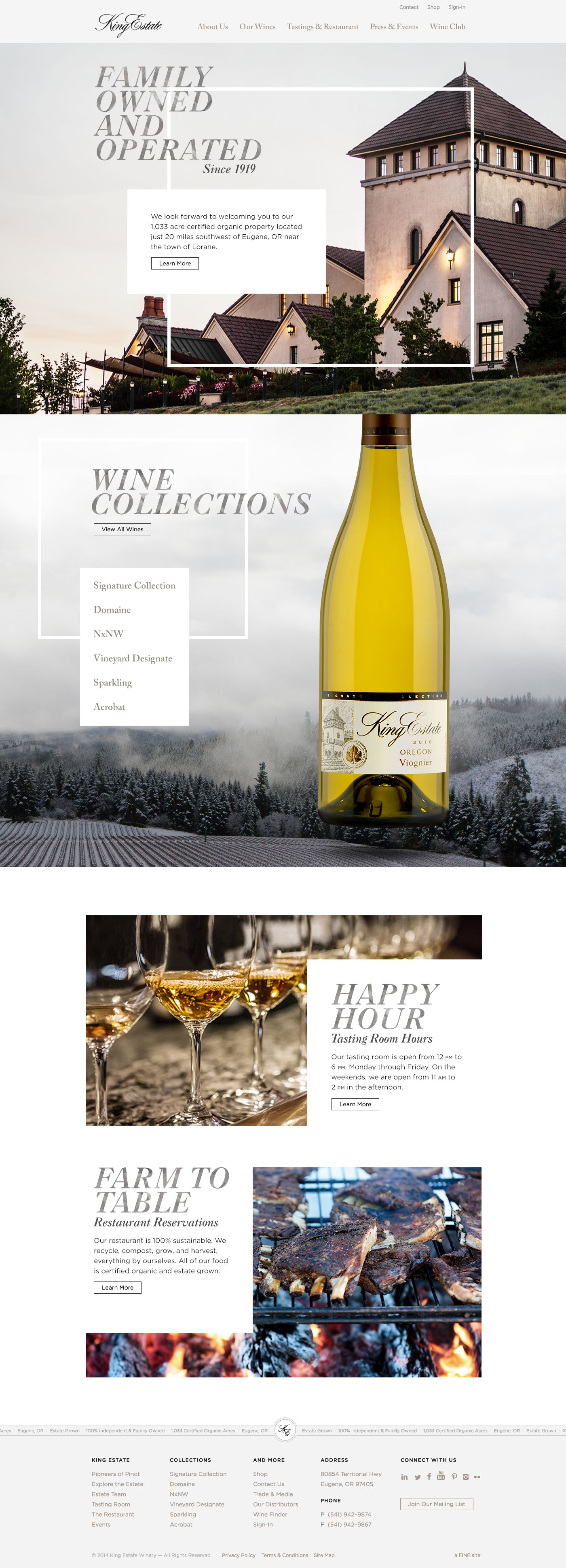

Project overview.
The redesign aimed to reposition King Estate as sophisticated yet approachable. Estate photography and a friendly, down-to-earth voice brought its family heritage, Oregon wines, and stewardship of the land into one coherent brand story.
At different phases of the project, I worked as a UX Designer, UI Designer, Interaction Designer, UX Strategist, and Information Architect. I collaborated closely with a front-end developer to translate the design into a responsive, modular template system.
The website was recognized by Communication Arts as a Webpick of the Day.
The challenge.
The website needed to make an immersive estate story easy to explore while giving visitors clear paths to find and purchase wine. The challenge was to carry the same visual character and practical navigation across desktop, tablet, and mobile.
The previous homepage below provides context for the redesign. The new experience brought estate exploration, wine shopping, and culinary content together within a consistent responsive framework.
Research & definition.
The website was organized around family heritage, estate exploration, wine discovery, and culinary content. The sitemap below shows how those areas connected, giving the brand story and practical shopping paths a shared structure.
That information architecture informed the responsive wireframes and templates, helping establish where content belonged and how visitors would move between the estate, its wines, and its restaurant.
Exploring the experience.
I broke the content into reusable modules and wireframed how each would behave on desktop, tablet, and mobile. I created an alphanumeric naming system to give the front-end developer a clear way to identify and implement those modules in code.
I worked closely with the developer to turn this structure into a flexible template system for both static and dynamic content. The studio planning and sketches below show the work of defining content sequences, image and text combinations, and navigation behavior across breakpoints.
Creating the aesthetic.
Moodboard & visual direction
I began with a moodboard that explored a refined yet welcoming expression of King Estate. Estate architecture, vineyard landscapes, wine bottles, and moments of hospitality grounded the direction in the people and place behind the wines. Generous white space, pale stone textures, warm gray tones, and fine geometric frames created a quiet backdrop, while expressive italic serif headings brought an editorial feel. I wanted the experience to feel sophisticated and personal, with the estate’s photography and family character at its center.
Typography & textured headings
I shaped the visual direction through expressive typography, custom textures, and a subdued palette. Large italic Caslon headings stacked into short lines alongside the estate photography, while Open Sans supported labels and practical information. Soft whites, warm grays, and charcoal let the photography carry the color.
The textured headings used CSS text masking, which was a new feature at the time. Working with the front-end developer, we successfully rendered the treatment across the major browsers. The style guide specified different textures for light imagery, dark photography, wine collections, and plain white backgrounds.
I created a comprehensive typography guide covering hierarchy, line height, spacing, alignment, and responsive treatments. These specifications helped carry the visual identity consistently across the modular templates. On mobile, textured headings became clean, solid-color type to preserve readability.
The final design.
The final website paired an image-driven brand experience with practical wine discovery and shopping. Estate and winery pages introduced the place and its hospitality, while responsive wine-detail pages brought product information and purchasing into the same visual system.
The shopping interface connected to a third-party purchasing service, and the broader website used a custom CMS to manage dynamic content. Culinary pages extended the story beyond the bottle through the restaurant and its recipes.
From the estate to the table.
Sustainability was central to the brand story. The restaurant content highlighted ingredients sourced from the estate’s grounds, connecting stewardship of the land with the dining experience. The restaurant and recipe screens below carry that story into food photography, menus, and culinary discovery.
The ecommerce experience.
The All Wines page supported filtering by varietal and collection. We used single-select filtering to prevent visitors from combining criteria that would lead to an empty results page. The browsing and product-detail screens below show how wine discovery connected with product information and purchasing.
Purchasing was integrated through an API from a third-party shop. The website’s dynamic content was managed through a custom CMS, with reusable templates keeping the estate and commerce experiences visually consistent across devices.
Outcomes & learnings.
Communication Arts selected the website as a Webpick of the Day. Its feature highlighted the responsive design grid, custom typography with masked textures, and the website’s expression of place and story.
The delivered website brought estate storytelling, wine commerce, and culinary content into one cohesive experience. For me, the project reinforced the importance of carrying a distinctive visual direction through every detail, from responsive layouts to typography and interaction. Close collaboration with the front-end developer helped translate that direction into the finished website while adapting it for different screen sizes.